Gated access
Can a small UX change save millions of dollars? I designed an onboarding gate that filtered out low-value users without hurting our best ones. And it worked.
- Role
- Product Design, UX Research
- Team
- PM, Data Analyst, Developers, Content Writer
- Timeline
- Feb 2025 – Oct 2025
The problem
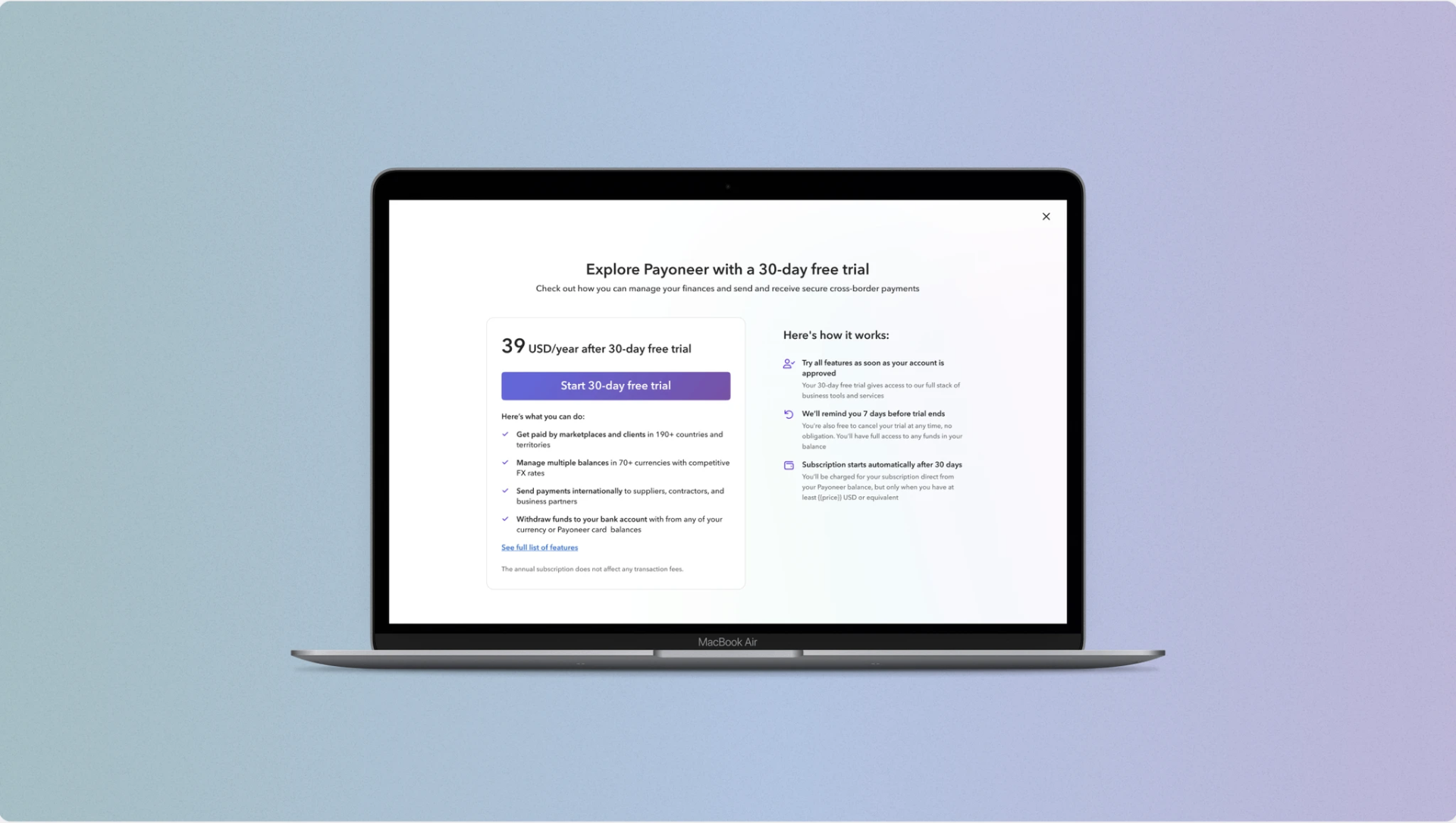
Payoneer attracts thousands of new registrants daily. But only 14% ever complete their first transaction, and just 4% match the ideal customer profile. The other 86% generate zero revenue while driving an estimated $16M per year in costs. The design question: how do you add friction that filters the wrong users without feeling like rejection to the right ones?
Research
I reviewed how leading platforms handle access gating — studying Airwallex, LinkedIn, Shopify, and Wise. Two dominant patterns emerged. Most players use a plan page right after user segmentation: it clarifies who the user is and surfaces a free trial as the primary conversion mechanism. The alternative is an upfront charge, which Wise and a few others employ.
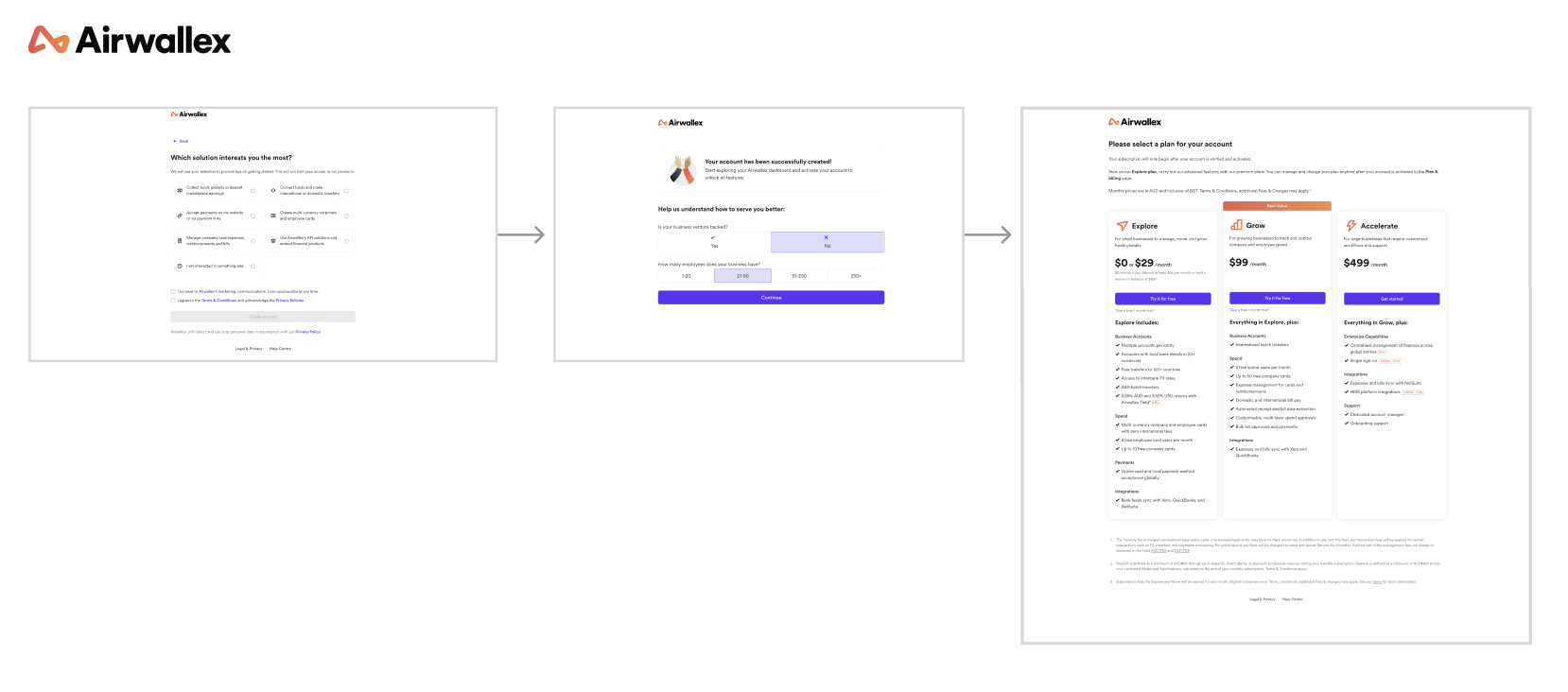
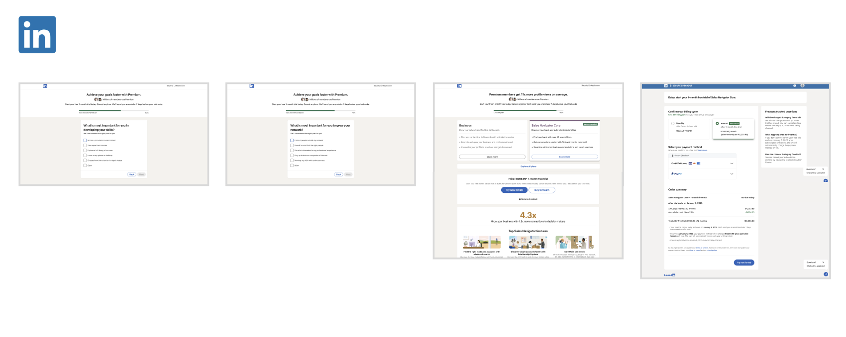
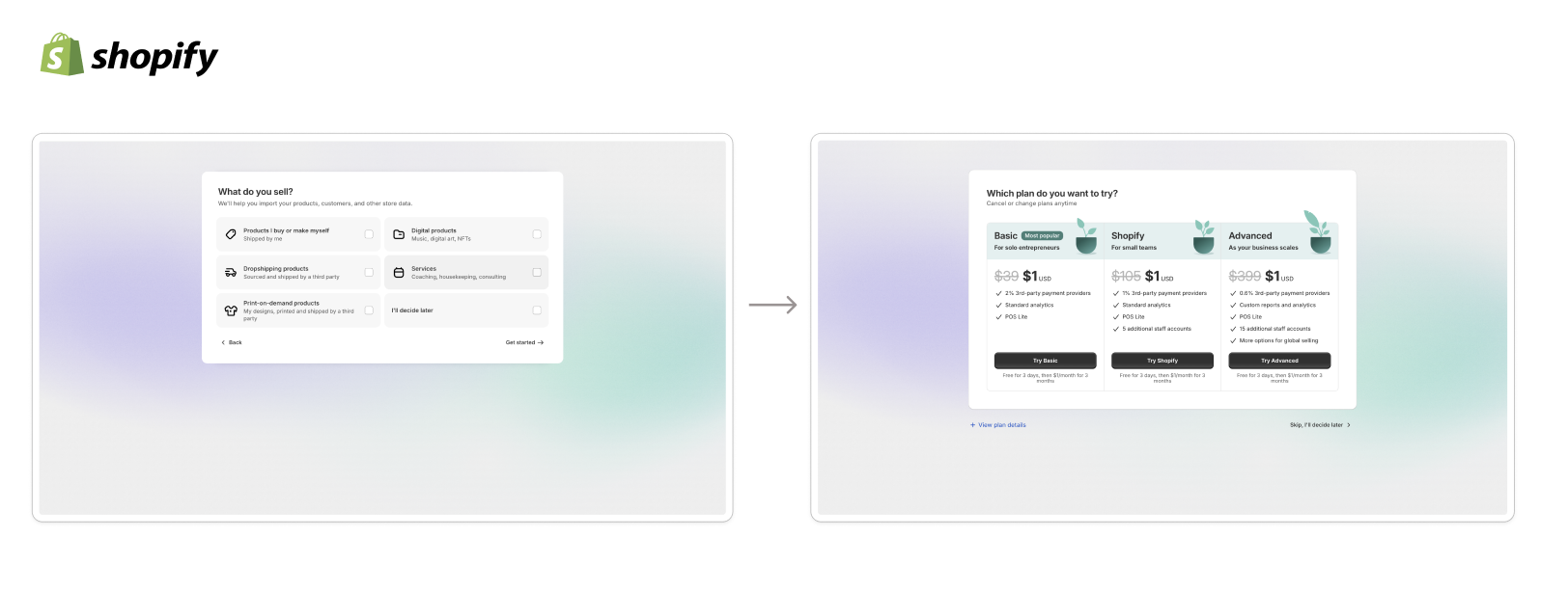
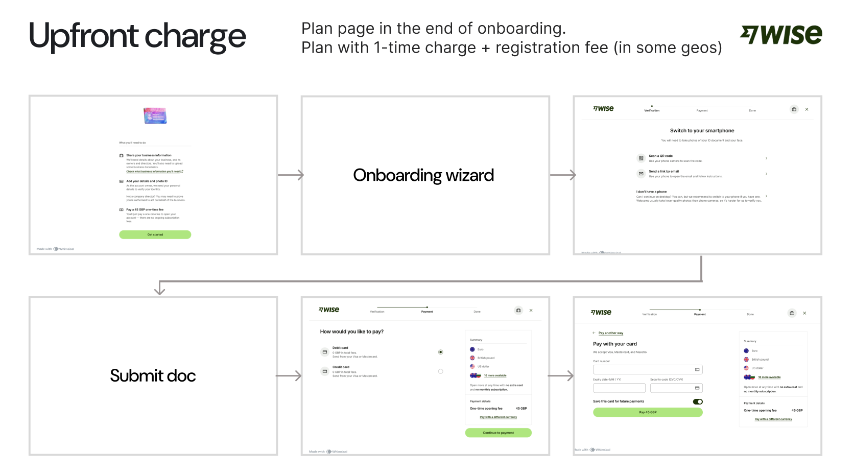
Before designing, I mapped the most common gate types used across the industry. This gave the team a shared language and helped us evaluate which approach fit Payoneer's context.
- Signup/login
- Account required
- Phone/email verification
- Age restriction (18+, 21+)
- Country/region restrictions
- Legal eligibility (tax, residency)
- Waitlist
- Delayed access
- Subscription required
- One-time purchase
- Paywall
- Credit card required for trial
- Long onboarding form
- Contract/agreement acceptance
- Admin approval
- Invitation sent by existing user (Dribble, Clubhouse)
Strategy and design
Before committing to a solution, we mapped out six gating approaches used across the industry. Each had different tradeoffs in terms of friction, conversion risk, and filtering power.
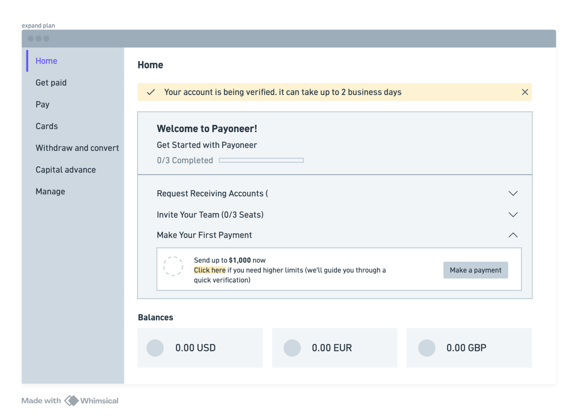
Plan selection
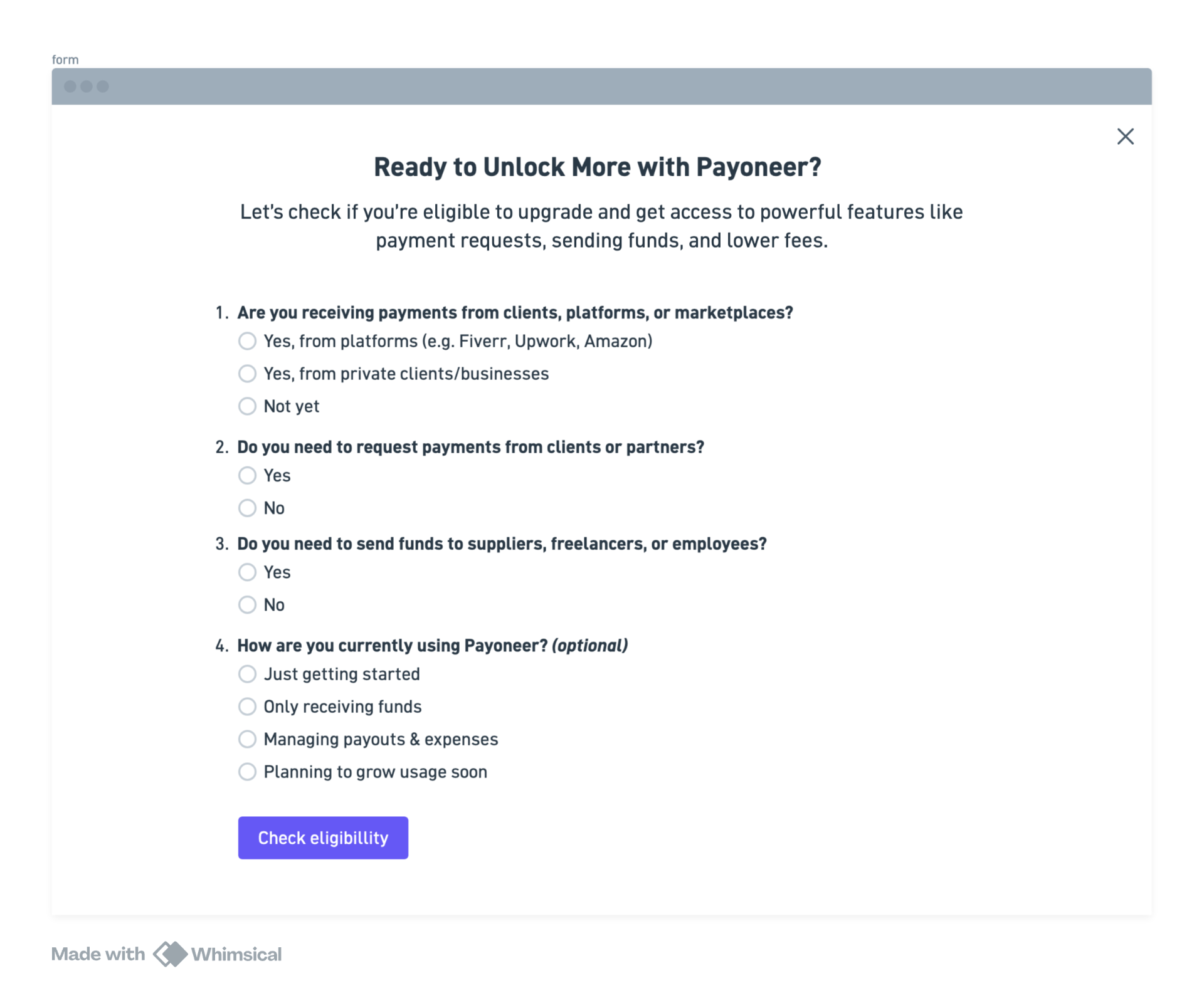
Commitment form
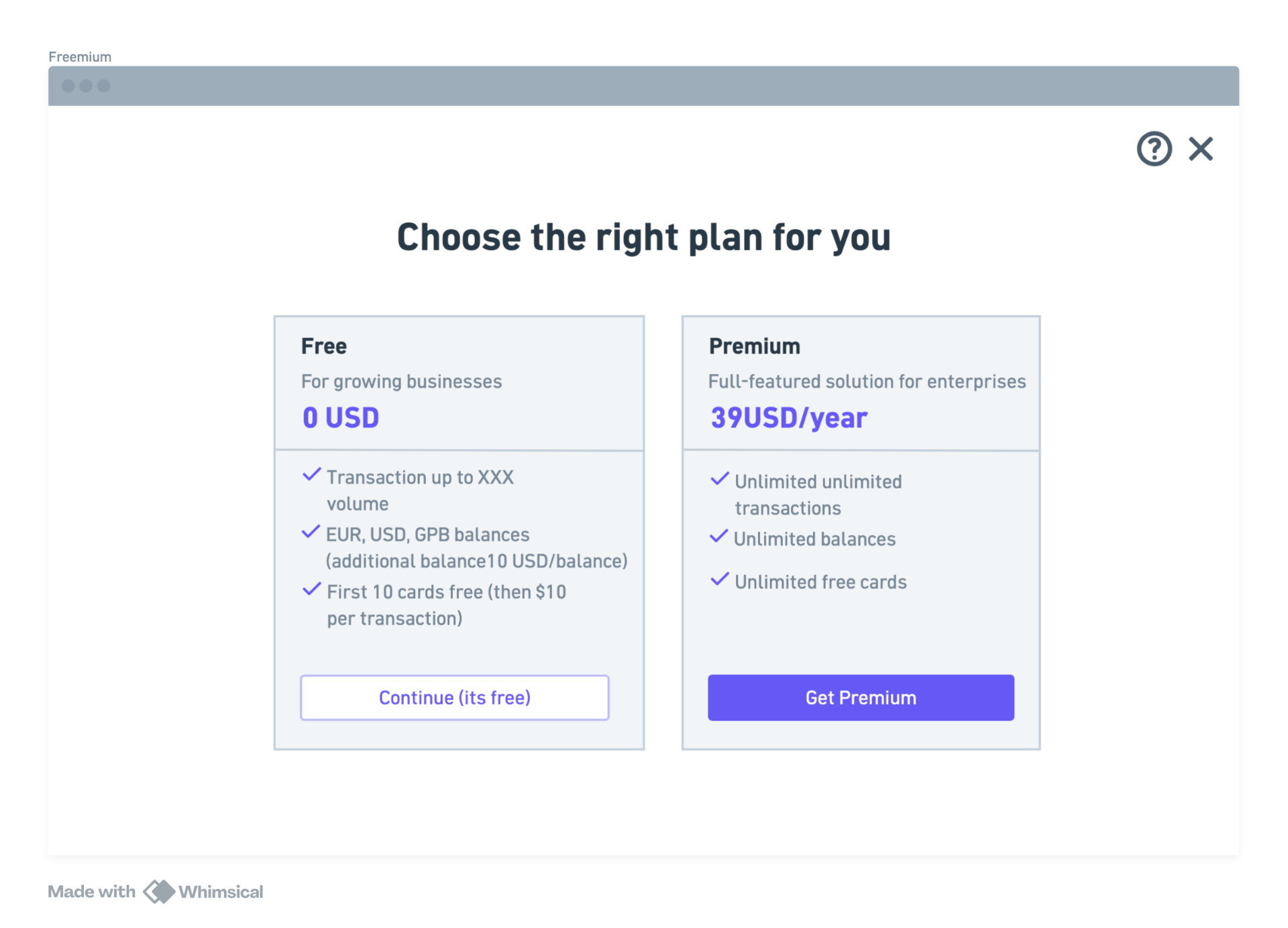
Freemium
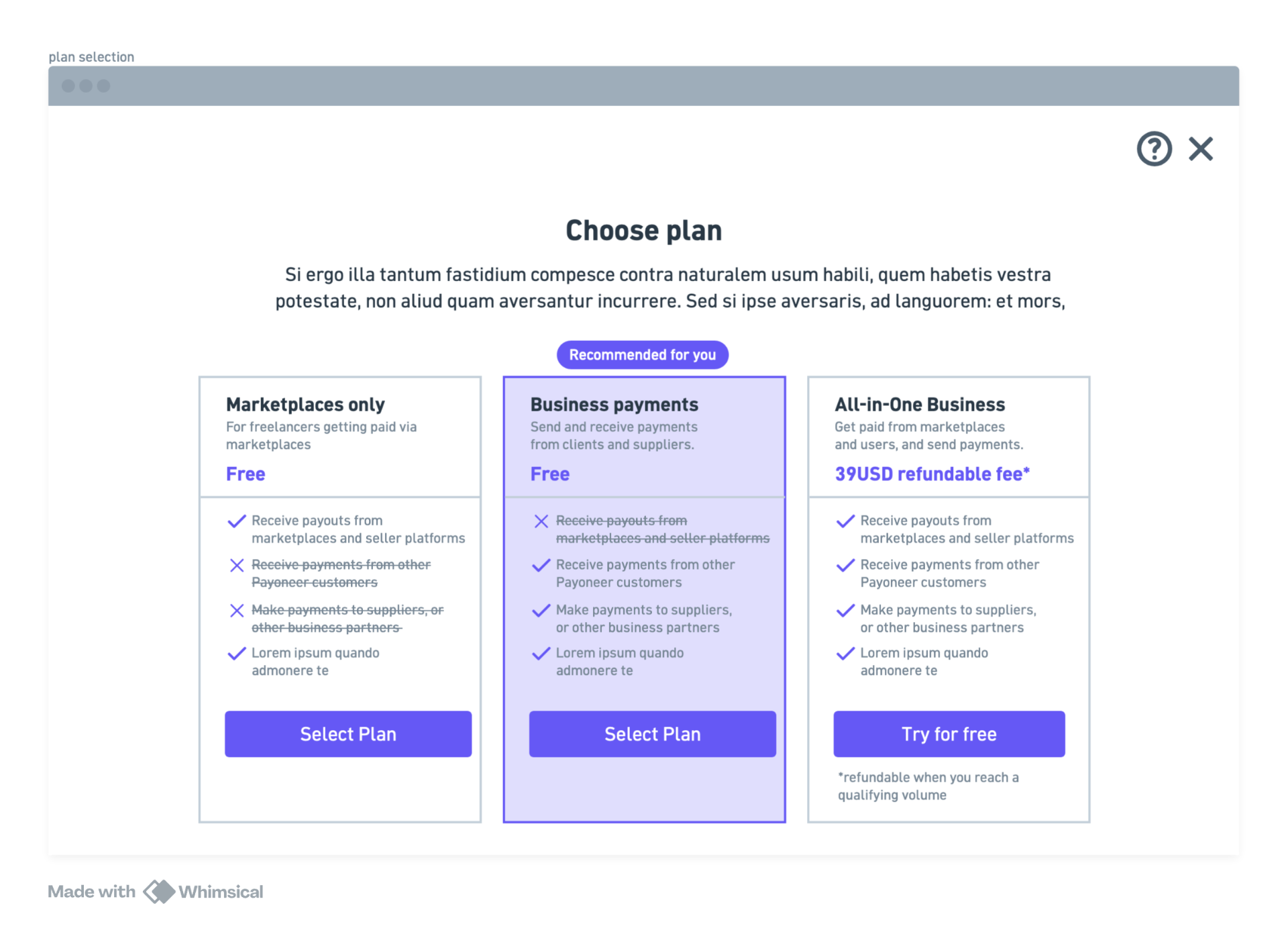
Expand basic plan
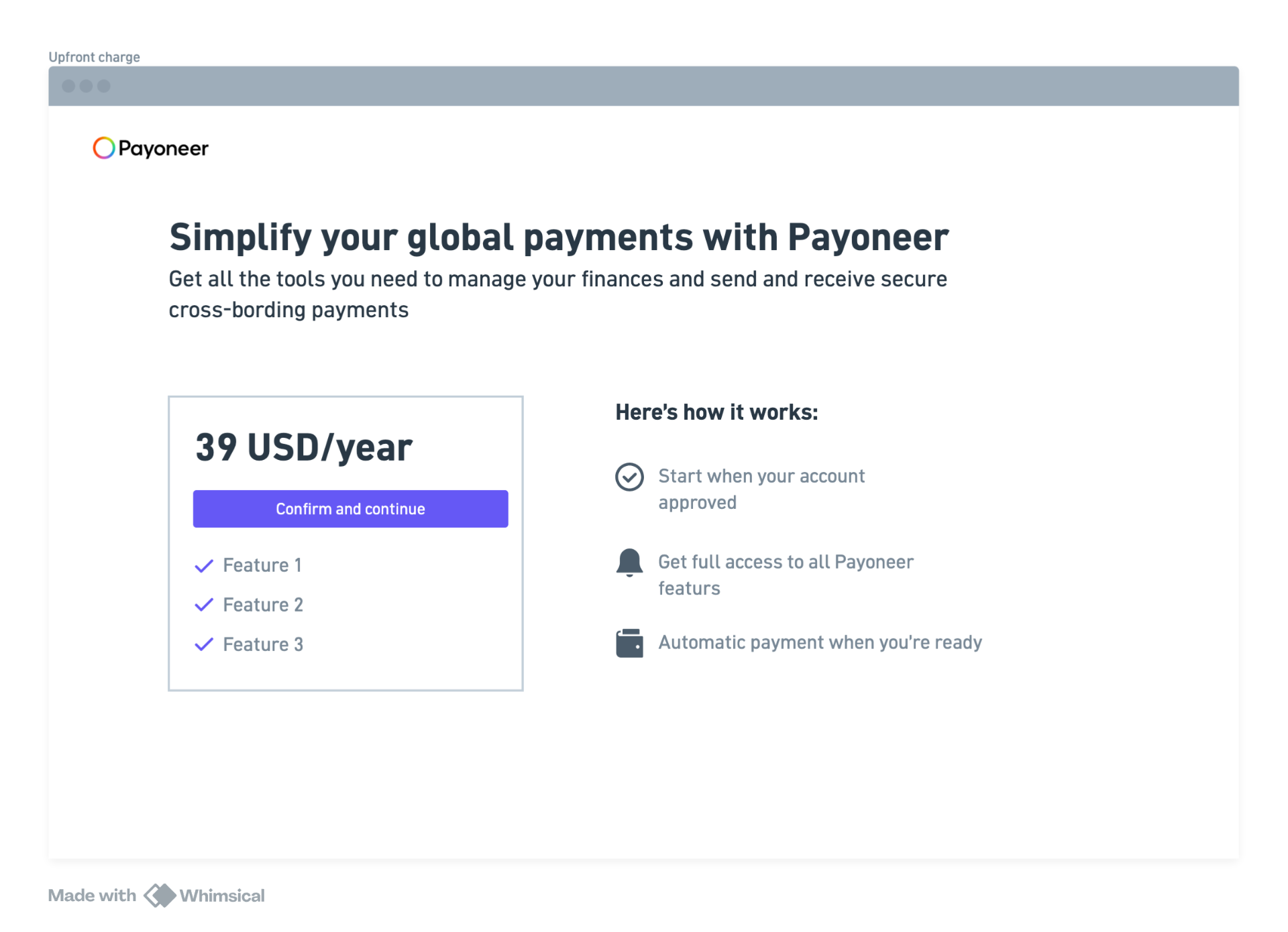
Upfront charge
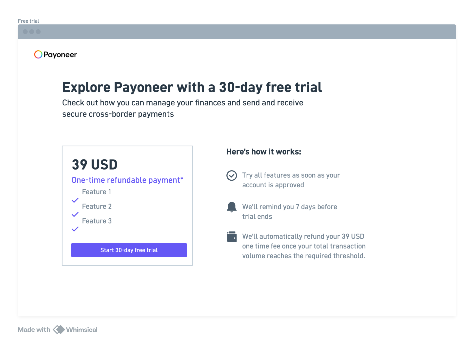
Free trial
We moved forward with Free Trial and Upfront Charge as the two strongest candidates for testing.
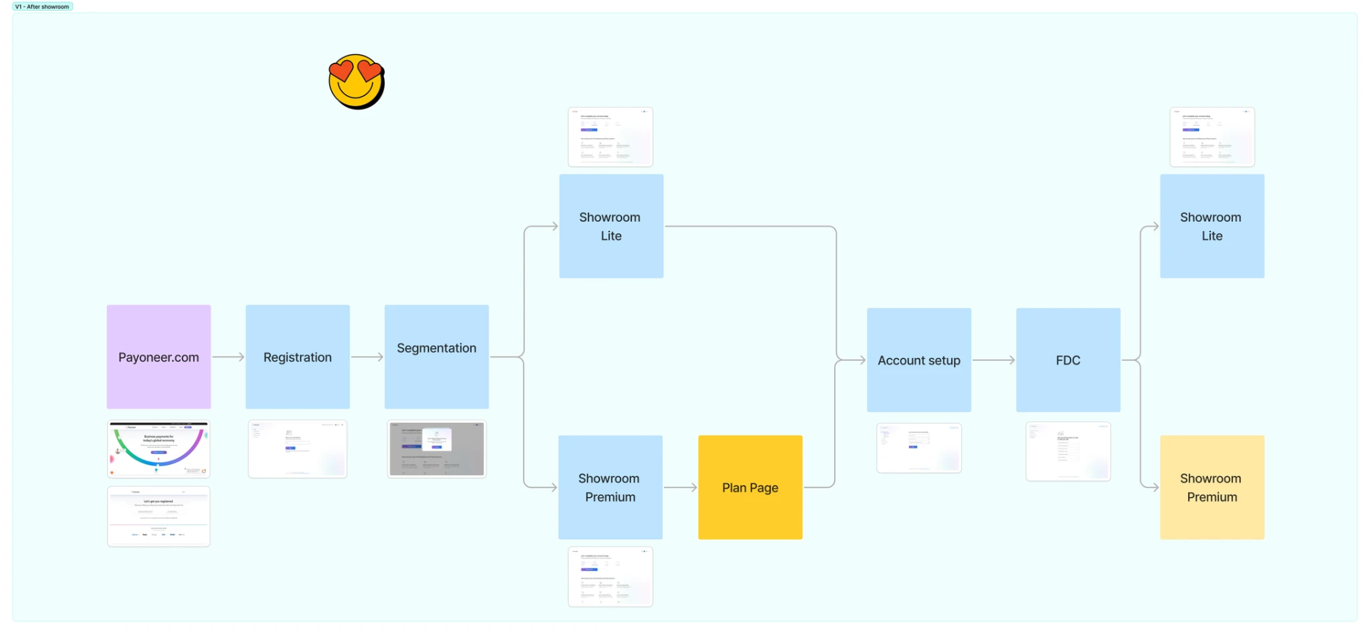
Since the plan page needed to be part of the onboarding flow, I collaborated closely with the Onboarding team's PM and Product Designer. We explored three potential locations:
- After segmentation questions, before the Showroom
- After the Showroom
- At the end of onboarding, post-document setup
After aligning on user and business goals, we chose to place the plan page after the Showroom. This way, the user first sees the product's value — features, benefits, tools — and only then encounters the commitment step. Placing it too early felt aggressive. Placing it at the very end risked frustration after users had already invested time.
Since pricing wasn't shown anywhere publicly at this stage, this screen became the first moment users discovered they would be asked to pay. That made copy, tone, and flow sequencing especially critical.
We designed three gate variants to test against regular onboarding as a control group.
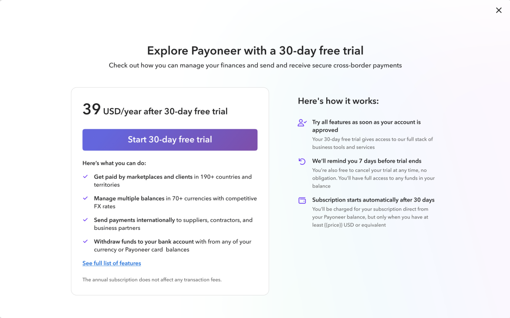
Free Trial
Full access for 30 days. Lowest friction, highest sense of safety.
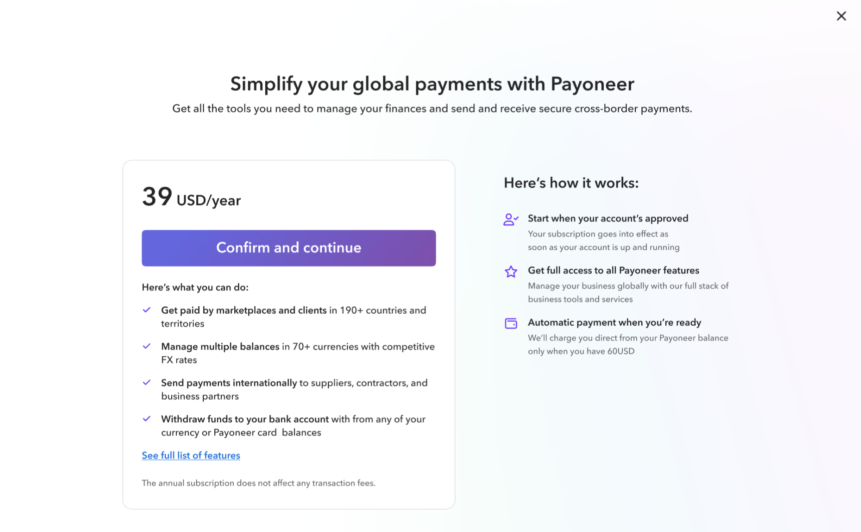
Upfront Charge
Pay via Payoneer balance once funds arrive. Medium friction.
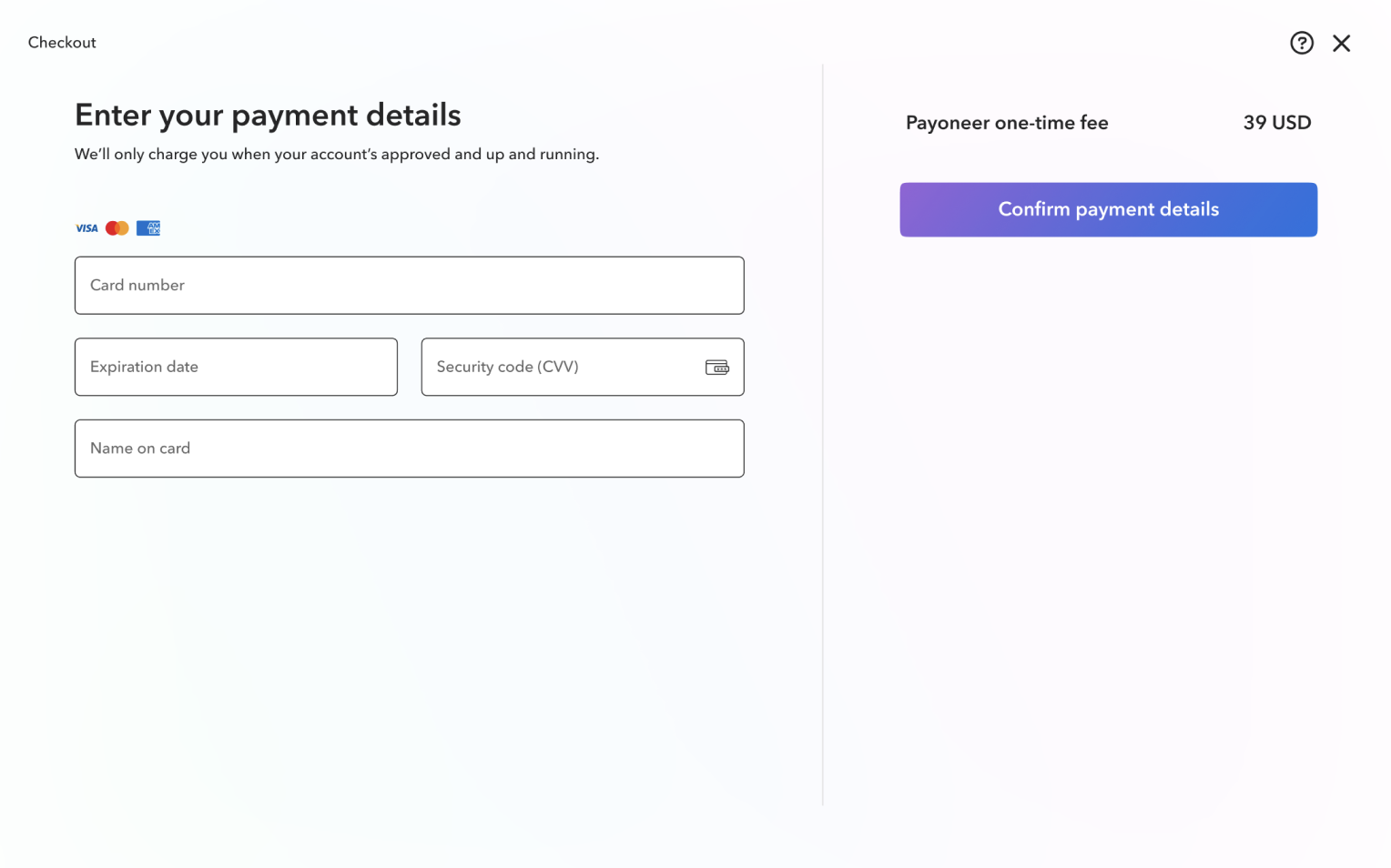
Credit Card Charge
Enter card details before continuing. Strongest commitment signal.
Setting up the experiment
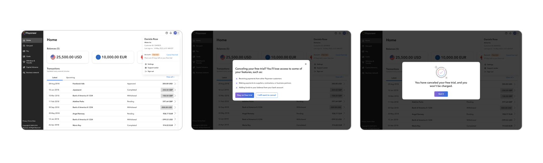
Our goal was to give users a sense of safety and the freedom to cancel anytime. But since this was still an experiment, we didn't have a real freemium plan, proper cancellation logic, or time to build full infrastructure. So we created a fake cancel flow — a real-feeling cancellation experience that gave users psychological safety without requiring engineering investment.
We couldn't charge users via credit card — only through their Payoneer balance. But new users had no balance yet. We solved this with a clear commitment message explaining that payment would be collected once funds arrived. This also introduced users to the Payoneer Balance concept at exactly the right moment.
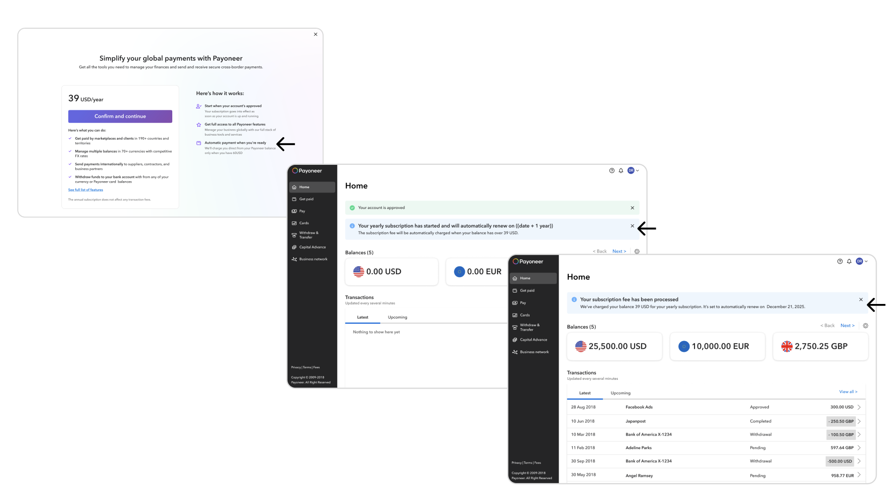
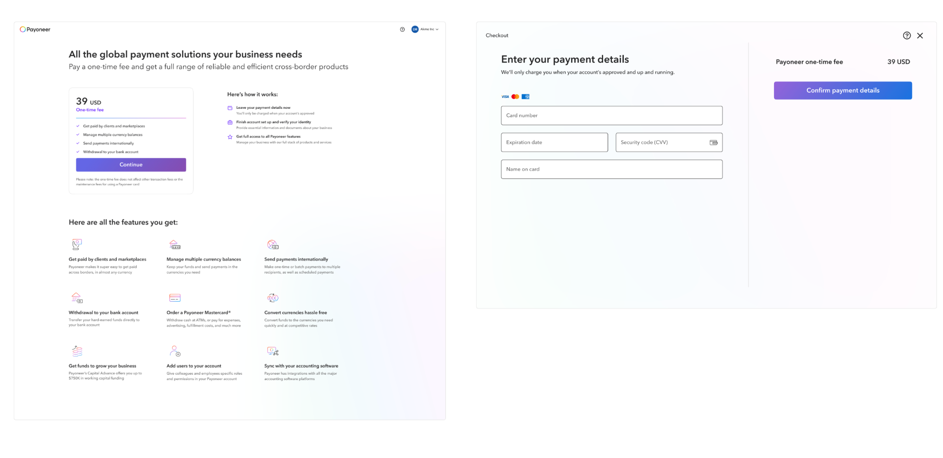
While running the first test, we worked in parallel on the technical ability to charge via credit card directly. This required merging the onboarding showroom with the plan page into a single unified experience. The strongest commitment gate we tested — users had to enter their card details before continuing.
- 01
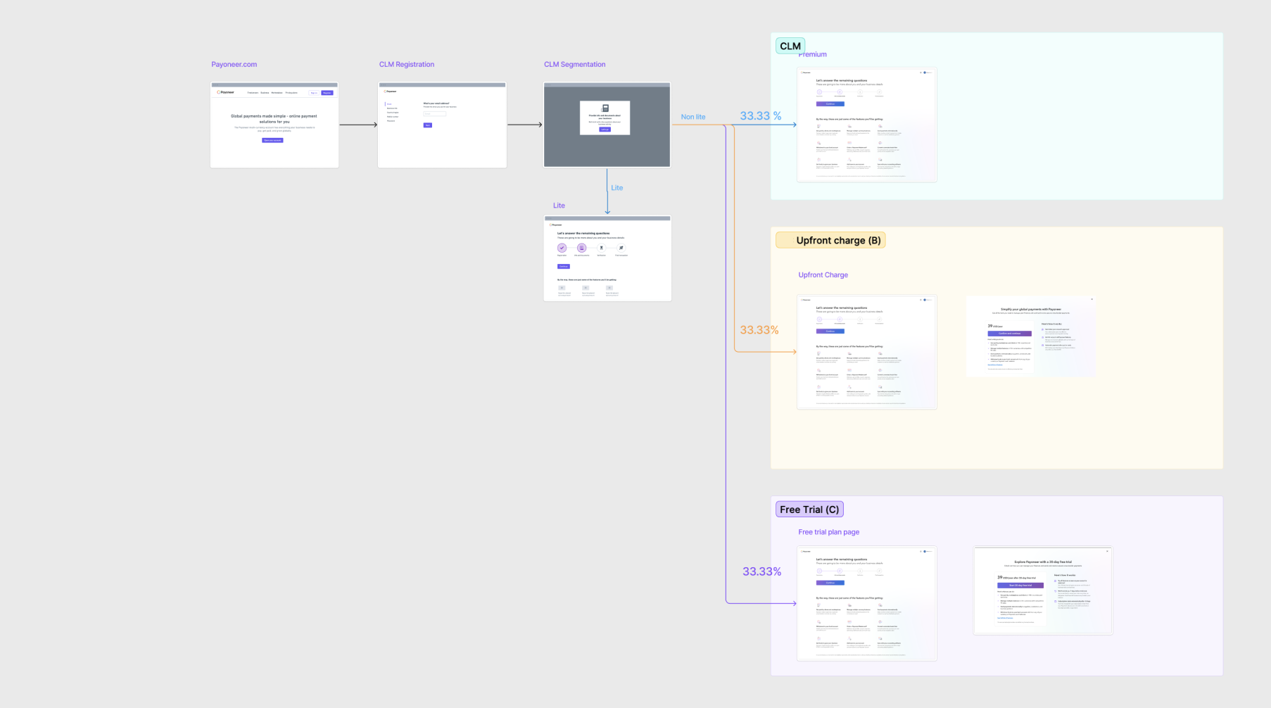
Three-Way Test
Free trial vs upfront charge vs regular onboarding as control. Tested across Kenya, Jamaica, Malaysia, Tanzania, South Africa, Ghana, Peru, and Algeria — 10,000 users per version — May to mid-July 2025.
- 02
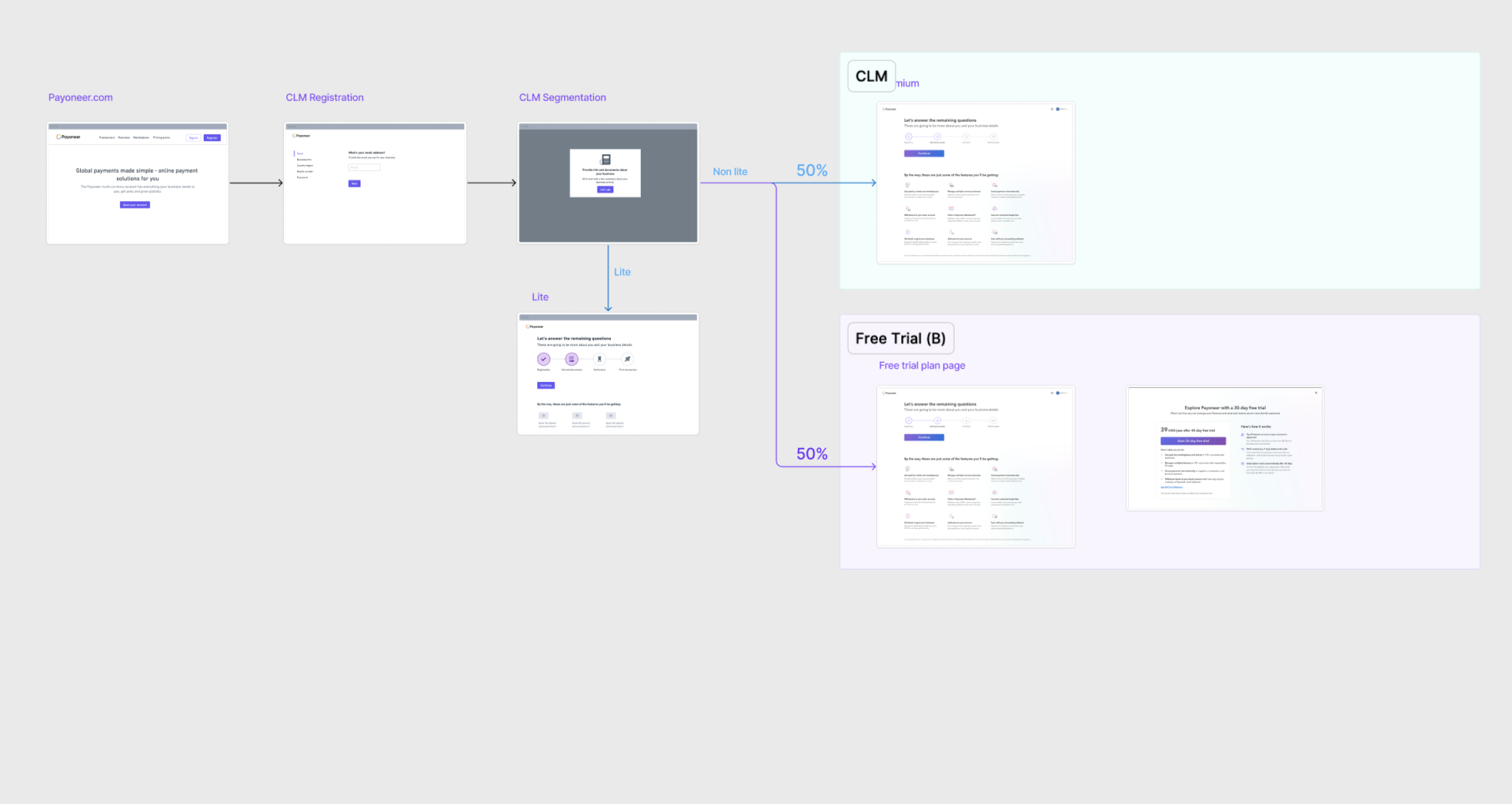
Narrowing Down
Excluded upfront charge after data showed it filtered valuable customers. Ran free trial vs regular onboarding across all countries.
- 03
Credit Card vs Free Trial
Once infrastructure was ready, ran a third test comparing credit card charge against free trial and regular onboarding.
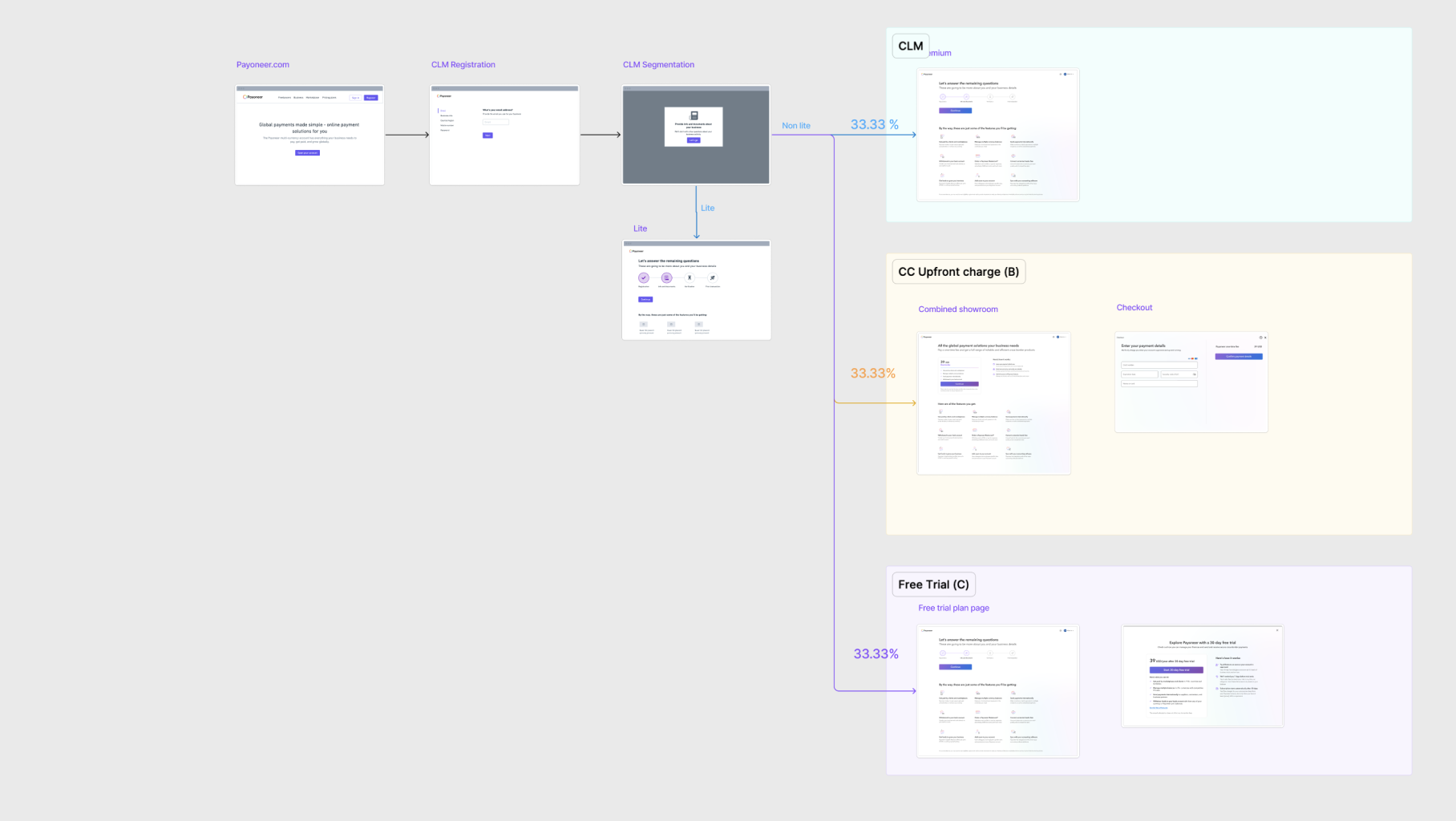
Round 1: Sanity Test
The first test ran across 9 countries with 9,000 users per group. Free trial won. Early signals confirmed it filtered low-quality users while keeping the valuable ones. Upfront charge showed filtering potential but removed some users we wanted to keep.
Round 2: Large Scale Confirmation
We scaled to all CLM countries, 14,000 users per group, 60 days. Free trial won again on every metric that mattered.
The gate filtered exactly who it should. D and C score users dropped significantly. High-value A and B score users were barely touched. Medium, Large, and SME segments saw zero impact. 80% of free trial cancellations were non-FFT users, which confirmed the gate was working.
Round 3: Credit Card Test
The credit card variant filtered too hard. Approvals dropped 53% compared to free trial. Total volume fell 17% and revenue per active user dropped 15%. We ruled it out.
Outcomes
Free trial outperformed every alternative. The right friction at the right moment improved funnel quality without hurting revenue.
Where the $5.2M comes from
- $2.1MKYC vendors
- $1.1MKYC tickets
- $1MScreening alerts
- $650KScreening vendors
- $250KCC onboarding tickets
The gate is moving toward global rollout across all country tiers, with lead scoring and segment-specific gate variations planned for the next phase.