User management
Turning Payoneer from a personal wallet into a multi-user business account that finance teams could actually share.
- Role
- Product Design, UX Research
- Team
- 7 engineers, 2 PMs, 1 content designer
- Timeline
- Sep 2023 – Jun 2024
The problem
Payoneer was built around a single user per account. That worked for freelancers but became a direct blocker for growing businesses that needed teams to access the platform securely.
Identity confusion: invited users saw the account owner's name and settings, not their own.
Fragmented login: separate login URLs due to legacy technical limitations.
Limited roles: only two roles available with no support for workflows like transaction approvals.
Outdated interface: not built for teams managing multiple users.
This was a company first priority. The inability to support team-based access was limiting Payoneer's ability to attract and retain enterprise clients.
Research
We conducted interviews with Payoneer clients across different business types and team sizes, synthesized using Hey Marvin. Four clear unmet needs emerged:
1. Roles were too broad: users wanted granular control over who could do what.
2. Teams needed maker-checker functionality: one person initiates a transaction, another approves it.
3. As organizations grew they needed better tracking and team-specific access like cards with user-level limits.
4. Only one email could receive login and payment notifications, creating a single point of failure.
I audited 9 platforms including Mercury, Square, Stripe, Airwallex, Wise, and Melio. Three patterns stood out: guided onboarding for invitations, clear role descriptions with easy comparison, and simple management dashboards.
What the market offered
| Platform | Number of roles | Custom roles | Guided invite flow | Role comparison | Maker-checker approvals | Management dashboard |
|---|---|---|---|---|---|---|
| Mercury | 7 | ✓ | ✓ | Role overview | ✕ | ✓ |
| Airwallex | 6 | ✓ | ✓ | Role overview | ✓ | ✓ |
| Wise | 5 | yes (since 2025) | ✓ | Table | ✓ | ✓ |
| Payoneer before | 1 | ✕ | ✕ | ✕ | ✕ | ✓ |
Design process
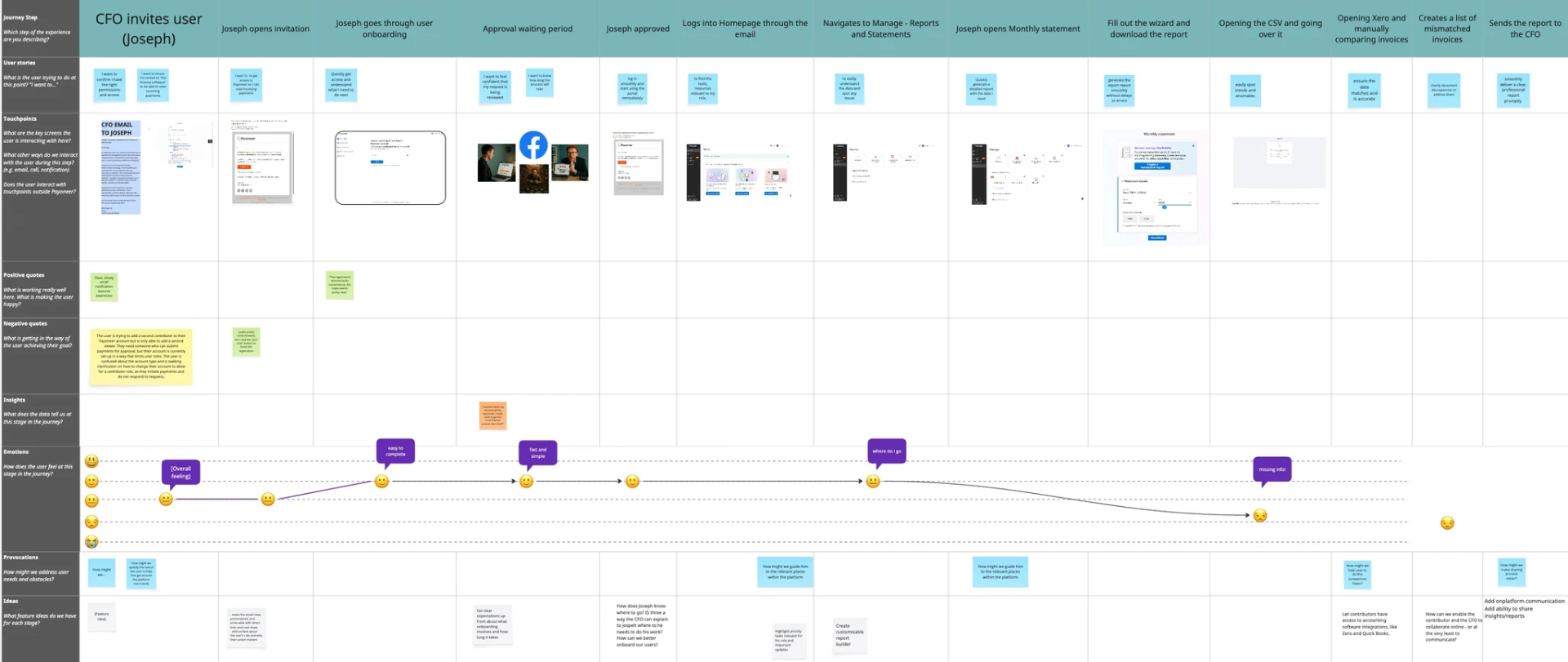
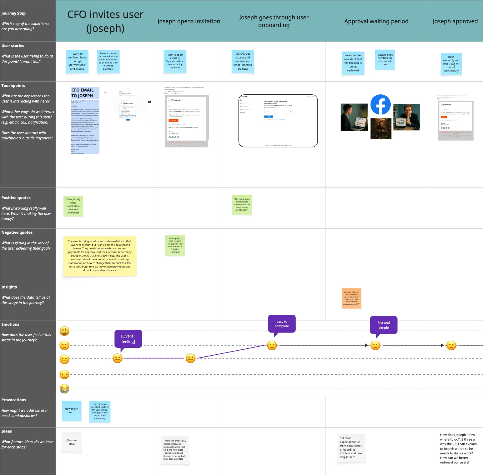
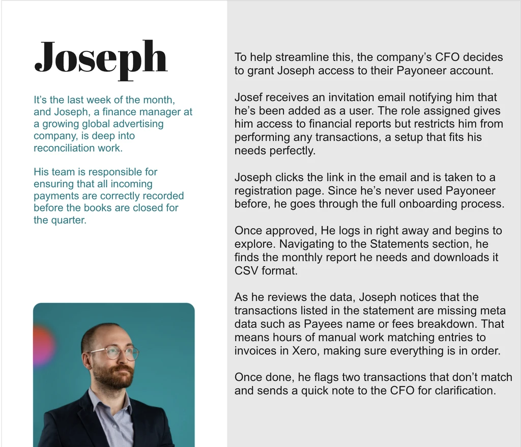
With research insights in hand, the next step was to translate them into a clear design strategy. I led a cross-functional workshop to create a user journey map that aligned the team on a single shared understanding of the end-to-end experience. Using the persona Joseph, we mapped his journey from inviting a new team member to managing their permissions and approving transactions. This exercise helped us do three things.
Identify pain points
The map highlighted moments of frustration, particularly around role assignment and notification management.
Find opportunities
It revealed ways to build trust through a more transparent, guided, and secure experience.
Prioritize efforts
Seeing the journey laid out helped us focus on simplifying the add user flow and redesigning the management dashboard.
Design solutions
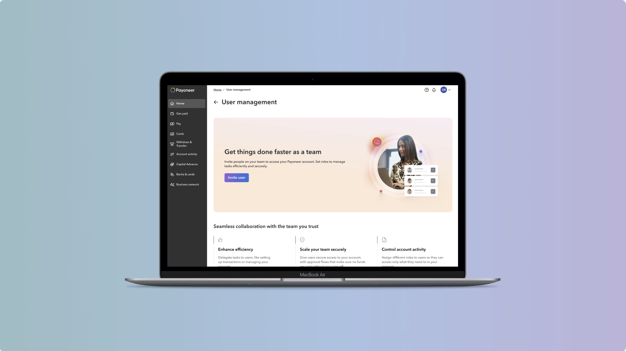
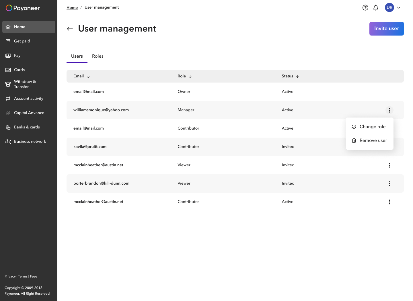
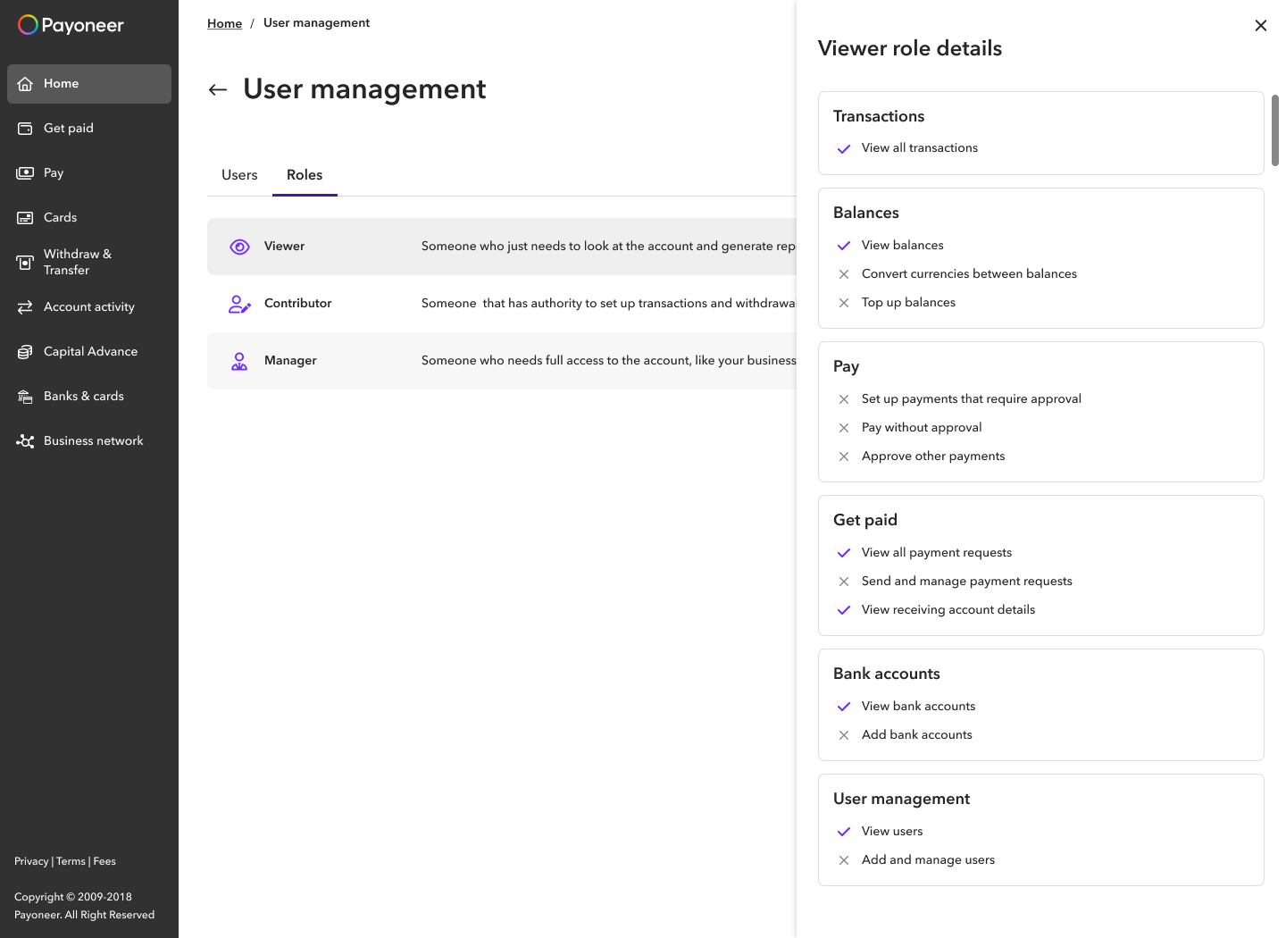
We restructured the management page around clarity and scalability. A new Roles tab gives users a permanent overview of all roles in one place. Permissions are described by product area, familiar from the main navigation, with clear visual indicators showing what each role can and cannot do. A contextual menu next to each user handles actions like change role and remove user. The structure is designed to scale as new actions and roles are added in the future.
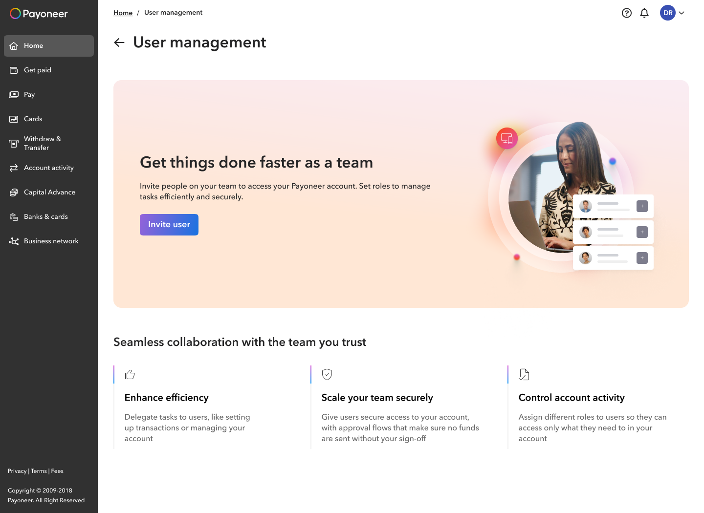
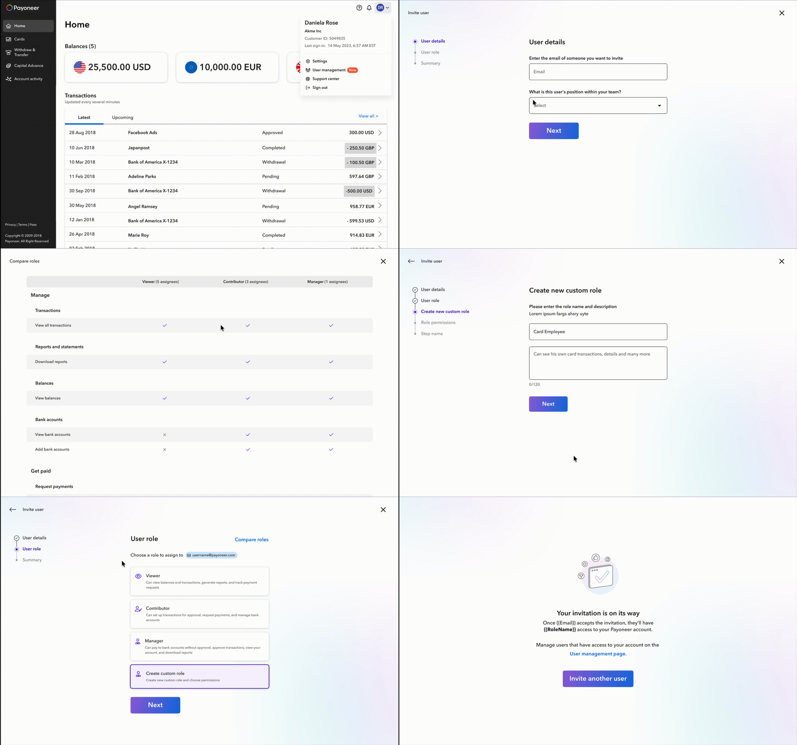
The original flow was fragmented, confusing, and offered too few roles. The redesign introduced a guided wizard that takes users through each step one at a time: user details, role selection, summary. The flow is scalable for new roles and supports custom role creation for granular permissions, one of the most requested features in research.
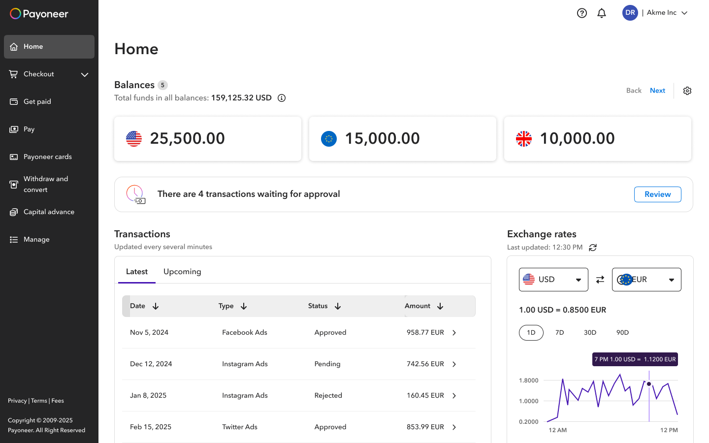
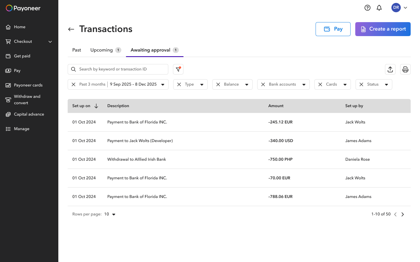
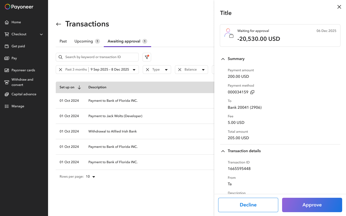
Maker-checker was a critical unmet need, especially for finance teams. We introduced a dedicated approval capability: contributors submit transactions for approval, managers approve or decline. The pending approval notification lives on the home page, where it gets a 90% click rate. Transactions awaiting approval have a dedicated tab within the transactions page, keeping them visible without cluttering the main activity feed.
Outcomes
Our team KPI was the number of active customers with more than one connected user. Two years of work moved that number significantly.
Active sub-users are users logging in under a Viewer or Contributor role, used as a proxy for multi-user account adoption.
Helped close enterprise deals
The maker-checker approval flow directly helped our sales team close deals with enterprise clients. It was one of the most requested features during the sales process.
Positive client feedback
CSMs reported consistent positive feedback after launch. Teams managing larger groups highlighted the new invite flow and role clarity as real improvements to how they work day to day.
The feature is now something our sales team actively leads with in conversations with larger clients.