Uniper web app
Designing a zero-to-one web platform for tech-savvy seniors. No hardware, no technician, no friction.
- Role
- Product Design, UX Research
- Team
- Product Manager, Developers, QA
- Timeline
- Under 6 months
About Uniper
Uniper is an online community that helps older adults connect with others. It provides live classes and content to help them stay active and fight social isolation.
Background
The original Uniper TV platform was designed for a single-user, remote-controlled experience. This worked for many users but became a real barrier for seniors who were already comfortable with modern digital tools. Three things made it hard to get started: scheduling a physical installation with a technician, learning multiple input devices including a camera and a remote control, and figuring out how to switch back to regular TV without getting frustrated and calling support.
Technician dependency
Scheduling a physical installation was a major barrier before users even started.
Device complexity
Learning a camera, remote control, and microphone made the first experience confusing and unintuitive.
Platform switching
Users often could not get back to regular TV without calling support.
User personas
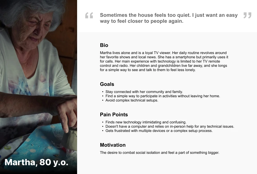
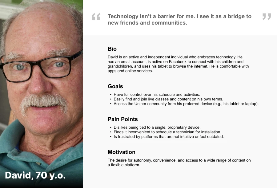
We defined two personas based on our research. Martha represents existing users who rely on simple TV-based technology. David represents the tech-savvy seniors we wanted to reach with the web platform. This case study focuses on David, since the web app was built specifically for people like him.
User journey
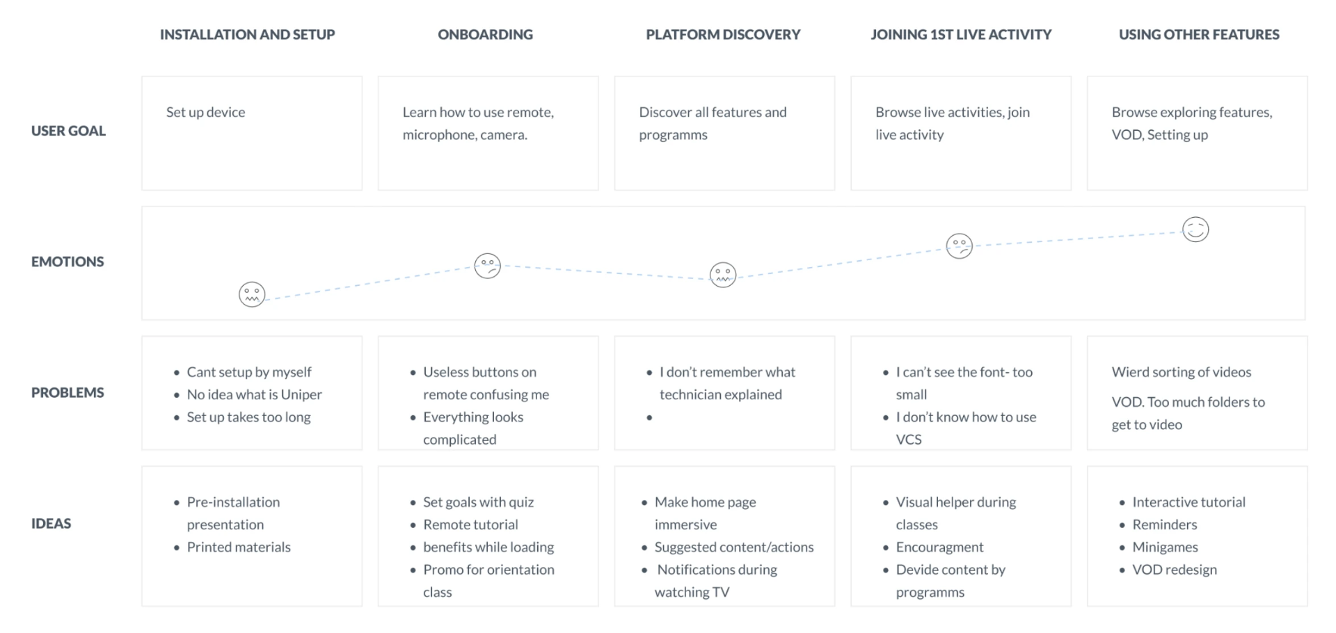
We mapped the emotional journey of TV platform users from first setup through regular use. Four moments stood out as the most frustrating. Installation felt overwhelming before users even started. Platform discovery was confusing because users had to remember what the technician explained. Joining a live activity was stressful due to small fonts and unclear video controls. Finding VOD content was hard because the library had too many folders with no clear structure.
Design
We designed a fully self-serve flow. No technician, no hardware, no complexity. Users set up their account in minutes from any device.
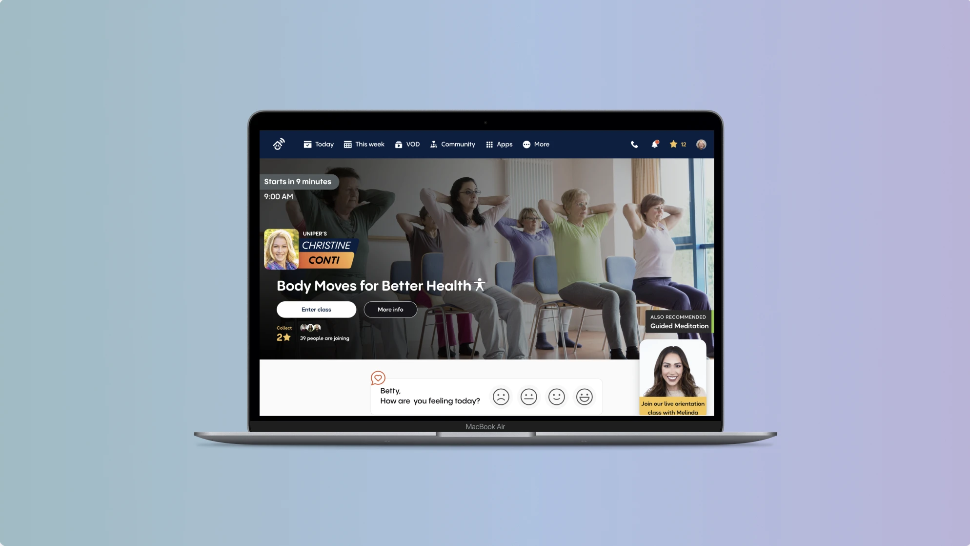
We added tooltips and an on-screen assistant called Melinda to help users find their way around. When a live class is happening, it leads the page as the hero element so users always know they can join right now. Content on the home page is personalized based on the goals users chose during signup.
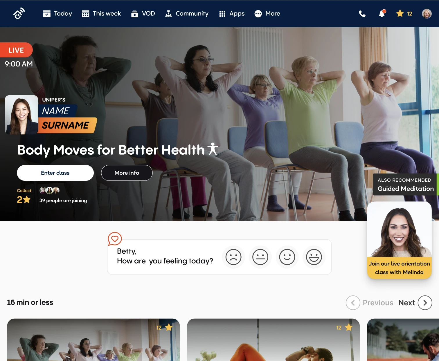
We kept the interface simple. Large buttons, clear labels, and nothing unnecessary on screen during a session.
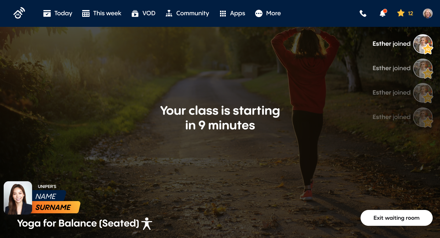
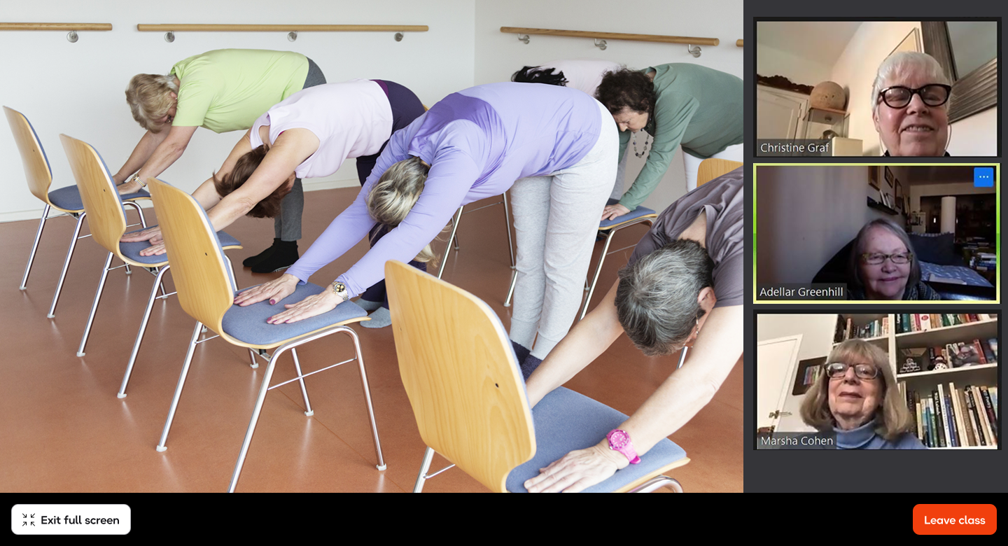
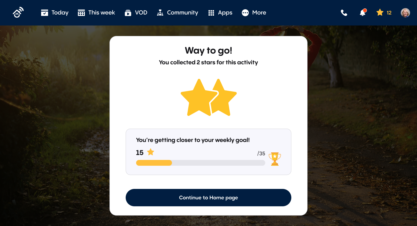
The week view helps users plan ahead and never miss a class. It deliberately references the TV program guide format from newspapers, which felt immediately familiar to this audience.

Outcomes
The web app removed hardware dependency entirely. Any senior with a computer or tablet could access Uniper without booking an installation. Following launch, Uniper secured new B2B contracts in the USA, Israel, Belgium, and France, and saw an increase in B2C users through digital marketing. The bigger shift was strategic. By proving the web experience worked, Uniper moved from being a hardware company to a platform company, opening partnership models that were not possible before.
New B2B contracts
Secured new contracts in the USA, Israel, Belgium, and France following launch.
Platform shift
Uniper moved from a hardware company to a platform company, opening new partnership models.